Sunday, May 11, 2014

UAS I: Introduction to UAS

Introduction

Prior to this lab the exposure to 1st hand UAS experience for many of the students in the Field Methods class was minimal. To further our understanding, earlier in the semester we had solved various geospatial problems using the various types of UASs, which was accompanied with the necessary research to better understand the components of a UAS and their capabilities. Given this research we learned much of the background knowledge the understand the operation of a UAS. With that in mind, this lab was intended to continue that learning and see first hand, just what we had been reading about and start our understanding into some of the equipment that can be used to collected data with a UAS. For our purposes we chose to collect aerial imagery.

Devices

Y6


Figure 1 shows the Y6 Arducopter on the ground. Note the three armed design
with six rotary blades. From this angle the twin battery packs can be seen, rectangular
features outlined with red straps and connecting wires.

Figure 2 shows the romote control used for manual flight with the Y6 arducopter.
This is a standard $50 unit with modified switches to enhance the functionality
of the Y6.

Figure 3 shows the Y6 up close. Note the flight camera in the lower center
portion of the image, as well as the Canon PowerShot used to capture the
aerial images. The PowerShot is attached to small burshless motors which
can be remotely turned to capture different angles. With the current payload
this Y6 model will have somewhere around 20 minutes of flight time.

Hexacopter


Figure 4 shows another form of multicopter, this is a hexacopter. Note the
six arms, each with their own rotary blades. The more arms, the more stable flight.
This has a trade off with the quicker drain of batter, and with that decreased
flight time.

Kite


Figure 5 shows the kite in construction. It is nothing more than three poles.
Two poles act as the frame and are fed in through the wings, the final pole
connects the two wings and acts as the support keeping the kite open while
in flight.

Figure 6 shows the kite after the quick assembly was complete. A model like
this will cost somewhere in the $100 range.

Figure 7 shows the picavet rig attached to the kite string. The best
method for this is to get the kite in the air, maybe 20 meters of line out.
Then once the kite is stable, attach the picavet rig, having two people
makes the job much easier.

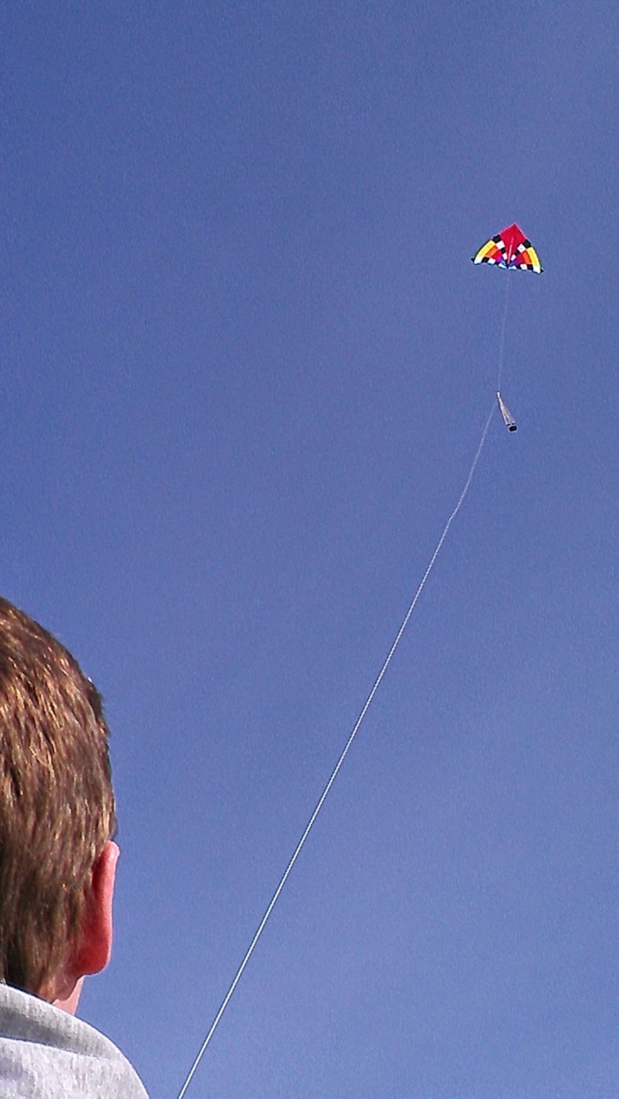
Figure 8 shows the kite in flight with
the attached picavet rig and camera
just below. This image has the kite
 at an altitude around 100 ft.


Rocket


Conclusion

Although this lab was only a window into the operation of a few UAS devices, I still thought it was an effective step into the future progression of learning UASs. We witnessed the take off and landing of the Y6, the construction and deployment of the kite with attatched picavet rig, as well what can go wrong if a rocket is not properly assembled. All jokes aside, I really enjoyed the lab and I'm excited to learn more about the actual surveying with the UASs. This is an area of great interest to me and I hope after this segment of UAS labs I have a better understanding in the world of unmanned aerial systems.

UAS II: Balloon Photogrammetry

Introduction

In two labs previous, we learned about the many types and components of UASs. In addition to this research, we also had a brief crash course into the operation of the many types of UAS in action. However, for both of these exercises we did not actually implement any aerial photography. Today we were going to take the next step in that progression and collect aerial photographs of a soccer complex located just south west of the University of Wiscosin - Eau Claire's campus.

one photo for every 5 seconds. 300 maximum pictures. 21 minutes max. 1 camera was 12.1 megapixels (canon PowerShot SX260 HS). Balloon was about 300 feet high...need about 50 m between walking paths for proper overlap.


PhotoScan Directions
  1. On the Tab list click Workflow
  2. Click Add Photos (only use the photos you want, if to many are used (~200) the process will take hours to complete)
  3. Add the photos you want to stitch together
  4. Once the photos are added go back to the Workflow tab and click Align Photos. This creates a Point Cloud, which is similar to LiDAR data.
  5. After the photos are aligned in the Workflow tab, click Build Mesh. This creates a Triangular Integrated Network (TIN) from the Point Cloud.
  6. After the TIN is created from the mesh, under Workflow click Create the Texture. Nothing will happen or appear different until you turn on the texture.
  7. Under the Tabs there will be a bunch of icons, some of them will be turned on all ready, but look for the one called Texture. Click on it to turn it on.
  8. If you want you can turn off the blue squares by clicking on the Camera icon.
  9. In order to export the image to use it in other programs; Under File, click Export Orthophoto. You can save it as a JPEG/TIFF/PNG. It's best to save it as a TIFF.
  10. With the photo exported as a TIFF, open ArcMap and bring in the TIFF photo and bring a satellite photo of Eau Claire or use the World Imagery base map.
  11. You will only need to Georeference the photos if the images you are using were not Geotagged. Open the Geoprocessing Tool-set.
  12. Click on the Viewer icon. The button with the magnifying glass on. This will open a separate viewer with the unreferenced TIFF in.
  13. Click Add Control Points. The control points will help move the photo to where it is supposed to be.
  14. With the control points click somewhere on the orthophoto, then click on the satellite image in ArcMap where the point in the unreferenced TIFF should be. Keep adding control points until the photo is referenced. The edges of the image will be distorted. Don't spend too much time adding control points there.
  15. The next step is to save the georeferenced image. Click on Georeferencing in the toolbar. Then click Rectify from the drop down menu. You can save it wherever you need it.


Geosetter Directions


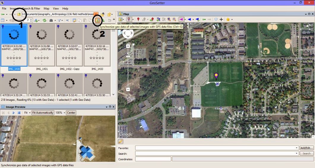
< !--[if !supportLists]-->1. <!--[endif]-->First you will need to open the images that you will want to use. The photos will go into the viewer box on the left side of the screen. Look at all the photos and make sure there are not any blue markers on them. If they have black/grey they have lat/long attached to them.


< !--[if !supportLists]-->2. <!--[endif]-->Click the icon circled and labeled 2 in figure 3. This allows you to select the tracklog that you want to embed in the images.


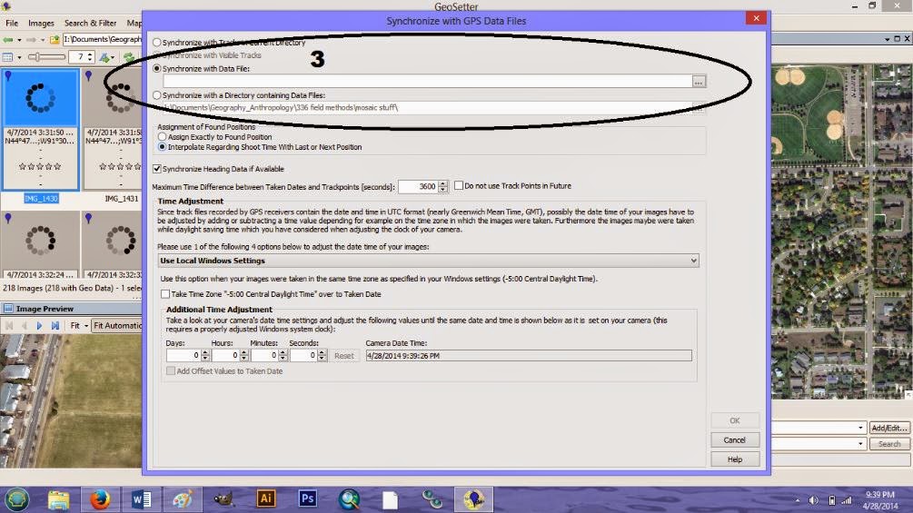
< !--[if !supportLists]-->3. <!--[endif]-->A window will open. Click Synchronize with Data File. Input the GPX track log (figure 3).


Figure 2. The GeoSetter interface.


Figure 3.  Embedding the tracklog, by time, into the images.


<!--[if !supportLists]-->4. <!--[endif]-->To save the images simply close out of the program. A prompt will ask if you would like to save your changes. Click yes. This will save the coordinates on the images.

Results


Figure 4 shows the amount of overlap between the images used in the mosaicking process. Images were taken with the CanonPower Shot, a 12.1 megapixel camera with a 4.5 mm focal length.


Figure 5 shows the resulting mosaic of the images, these were not geotagged. This is a mirror image and rotated about 30 degrees counter-clockwise. This was corrected using Photoshop, then georeferenced in ArcMap.


Figure 6 shows the mosaic of the geotagged images from the other camera. Even though the image has less contrast, some minor adjustments in photoshop can quickly improve the image.


Figure 7 shows the DEM of the mosaicked geotagged images. This model is extremely accurate, but upon closer inspection a close eye can notice the many improvements that could be made by collecting more extensive imagery.

Discussion

Focus on the difference between georeferencing and orthogrammetry...georeferencing doesn't take the z-factor into account.

Conclusion


This lab initially felt like a laid back lab, consisting of filling up a large weather balloon with helium and then walking around a soccer field in various patterns. However, once the post processing came into play, you realized how effective the exercise was. With the proper amount of overlap between the pictures we were able to produce a low cost DEM of the area. For future reference this could be deployed on site for low cost budget products in the absence of wind.

I thought today was important in a few ways. One, it gave us first hand experience into a method of collecting aerial photographs. Two, it required that we research more into the parameters that needed to be met during the survey to make a DEM; i.e. Given the elevation of 300 feet, what should the distance between walking passes be?). Finally, the lab gave each student a little more confidence into the abilities we all have. It showed us with a little investment, we could go out in the world and produce data for employers. As we discovered the data would not match that of high technologies, say fixed wing sensing or LiDAR, however it is a start into the technologies of UAS sensing.

Saturday, May 10, 2014

Priory Navigation 3: Navigation with GPS

Introduction

This will be the final blog in the three part Priory navigation series. The first two exercises focused on traditional navigation (orienteering post) using map and compass. Considerable effort was focused on map production (map construction post) and elements essential to orienteering. Now that the orienteering exercise is complete, a comparative example with the modern technology of GPS will be used for navigation. Again it will be a race against the other 6 groups in this Field Methods class to finish the course.

There will be exceptions to this exercise. The previous exercise only required each group to navigate one of the five point courses, this time each group will navigate all three courses, 15 flags in total. In addition to navigating the entire orienteering course, there will be an added element of stress. To simulate high pressure deadlines and other daily stressors of real world career jobs, each group member will be given paintball guns. Since the main goal is a race to the finish, if you are hit you must stop for one minute. The only other rules require each group to carry a GPS and collect a point at each flag showing they made it to all the course flags.
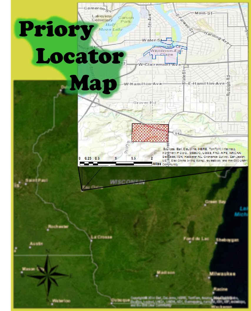
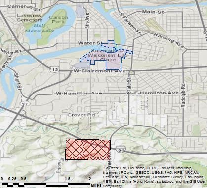
Figure 1 a locator map of the Priory. A 112-acre parcel of land
on lease by the University of Wisconsin - Eau Claire. On the
Priory land lays an orienteering course consisting of 15 flags.
Most of the course is found in dense tree covered land with
considerable underbrush. In addition, most of the land has
varied elevation, with the most hilly regions concentrated on
the western side of the course.

Once again the course will be located at the Priory, shown by the red polygon in figure 1. A 112-acre parcel of land located 2 miles south of the University of Wisconsin - Eau Claire campus. The Priory consist of three buildings which host the UWEC childcare center and act as a dormitory for students during the school year. These buildings will be off limits during the exercise and designated as "no shooting zones." For liability reasons the students were told to stick to the trees and avoid the open areas at all costs. Even though the staff were informed of the situation, there was no reason to push the envelope on this situation. The actual orienteering course itself surrounds the buildings in the heavily wooded areas. Mostly consisting of deciduous trees, thick underbrush, and a group of pine trees on the eastern portion of the course.

Requirements for the Exercise:
1) No shooting or walking through the "no shooting zones"
2) No shooting at anyone without a mask on
3) Start at your assigned starting point (1, 2, or 3)
4) Travel to your assigned first point before all other points.
*The starting point and first point collected were assigned in order to disperse the groups around the course initially, increasing the chance of encounters later in the exercise.

Methods

After completion of the orienteering course it was an immediate realization how the terrain was a major factor in navigating. With this in mind, the planning for this GPS navigation exercise was much more extensive. As a group we spent three hours weighing the pros and cons of taking certain paths. Questions such as, which type of trees would be quickest to travel through? Would it be quicker to run along a ridge slightly out of the way, or go up and over the hill instead? All these parameters were layed out before we started making a map. We wanted to know what to look for before we started making hasty decisions.

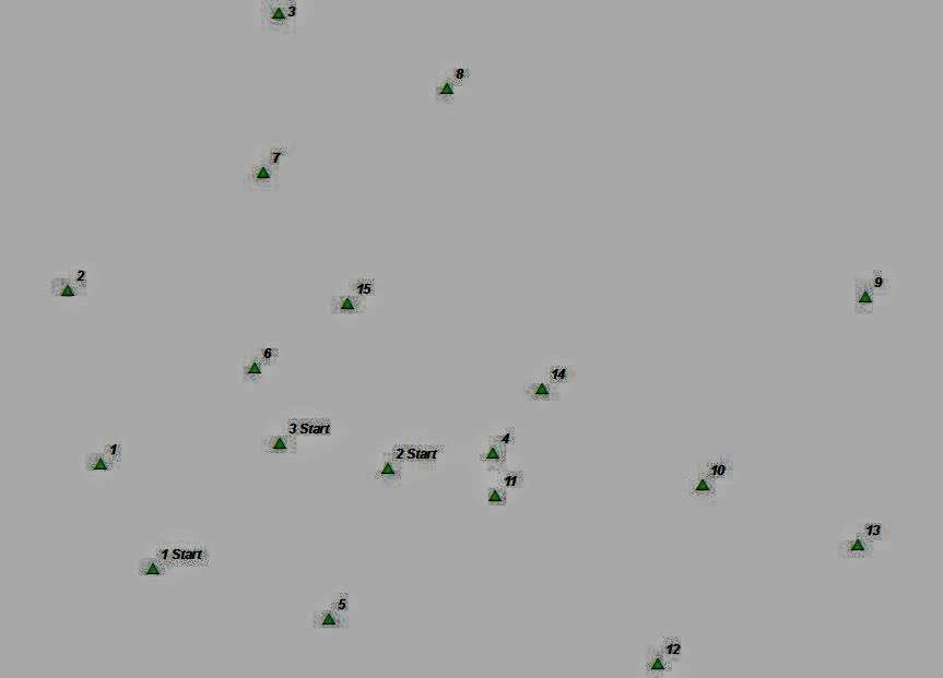
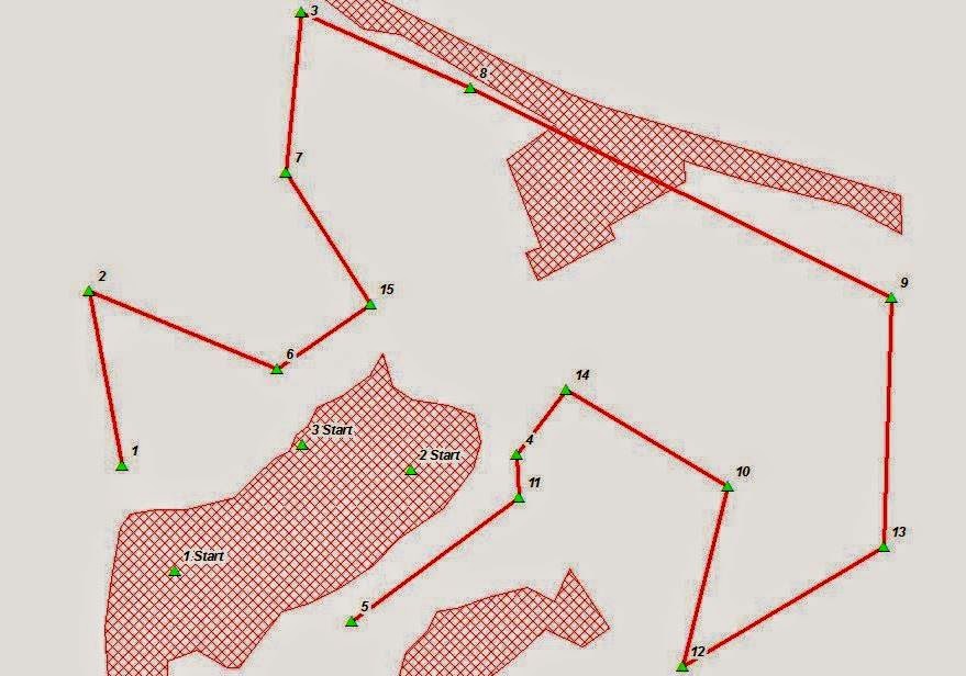
Figure 2  Shows the feature class newly acquired during this
exercise. The feature class includes all three starting points
for the different courses, as well as all 15 points on the
orienteering course. Our group started from "1 start"
and traveled to point 5 first. These were the only requirements
of travel, the rest of the points could be collected in any order.
The first step taken was looking at the newly added feature class showing all 15 flag locations. We only had coordinates to these points during the last exercise, and we only plotted 5 of those points. So analyzing the points for the first time and thinking what the terrain around those points would be, was a rather important first step. Figure 2 shows the feature class of the orienteering flags and the three starting points.

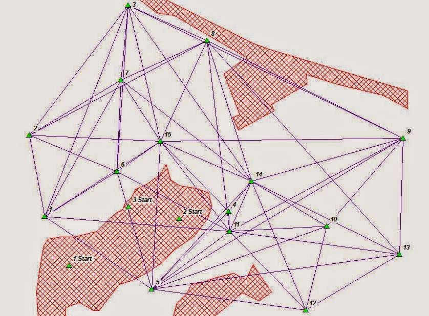
Next we had to develop a network to connect the points. Devise a rudimentary system to narrow down which routes were plausible and eliminate those illogical. To do this we digitized connecting lines from flag to flag. Since some routes were obvious choices not to take, these were omitted from the digitizing phase. Figure 3 shows the results of the digitizing phase.
Figure 3 Shows the feature class of orienteering flags, the digitized connecting paths, and the no shooting zones surrounding the childcare center (left), a local home (bottom/center), and a holding pond/I-94 (upper right).
Next we brought in a DEM of the area. Looking at the elevation of the land was helpful, but it wasn't the most effective tool for navigating. That is why we created a slope feature class from the DEM. We created the slope feature class because some points were at the top of hills. This meant we had to get to the top, but some paths to the top require less energy than others.

Once we created the slope model, we then reclassified the feature class for better planning purposes. The reclass had three categories: low, medium, and high slope values. When planning the route we tried our best to stay out of the red areas, or areas of high slope. Even if we weren't traveling up the slopes, most of the trees were still difficult to walk through, especially the northwest quarter of the map, there was a lot of underbrush here.
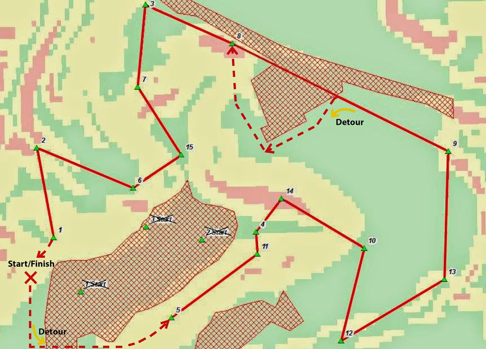
Figure 4 shows the path the group decided was most efficient. Due to some last minute judgement calls the prior starting points were foregone to a more parent friendly location, which was located West of the parking lot (start point 1 was in the parking lot). Noteworthy observations of this figure are the dashed red lines. These lines represent routing changes while in the field. The new start/finish point meant we had to travel due South from the start and quickly cross over the parking lot entrance. The second detour came when we approached the holding pond. Once at the edge of the holding pond we reached a barbed-wire fence which we followed until we reached the normal planned route. Other features on the map is the classified slope model. Green = values of low slope, yellow = areas of moderate slope, and red =  areas of high slope.
Once the route was chosen, we had to decide what was going to be deployed to the GPS. Our Professor had stress the importance of only deploying the essential elements to ArcPad to decrease the loading time of the maps. We kept this in mind when we decided not to include the basemap. We were looking for speed, and we didn't want to wait around for the GPS to load every time the screen needed to be refreshed. Figure 5 shows the three features included on the GPS: a point file for the flags, the path we were going to travel on, and the no shooting boundaries.
Figure 5 shows the features chosen for upload with ArcPad onto the GPS unit. With the uncertainty of how the GPS would perform in the field the group thought it would be best to limit the features uploaded. Although there wasn't any reference information outside of the connecting lines/paths, the group decided that locator arrow was enough to navigate the course with.
Since we knew there would only be one GPS in the group, we thought it would be important to bring a map with as well. Since the GPS didn't have a basemap, this was the first feature we added. Next, were the features deployed to ArcPad. During the process we discovered a shapefile detailing the location of all the trails at the priory. Initially we tried to include them in our analysis, but in the end we decided the searching for the trails could take longer than just blazing our own way through the trees. The last feature added was a table showing the distances between each point.
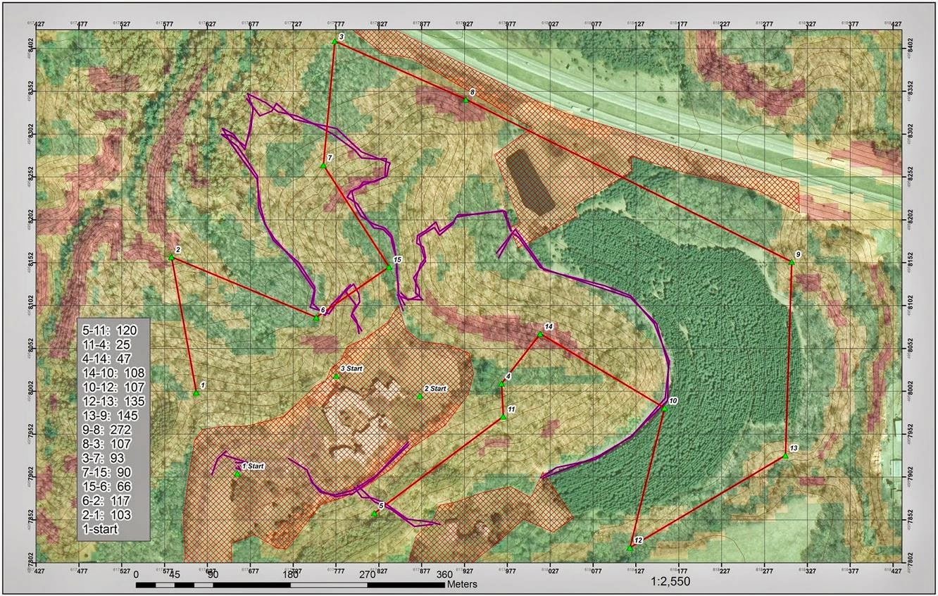
Figure 6 shows the field map created for the members without a GPS. The values in the lower left hand table are the distance in meters between each point. The red lines are the path we decided to take. The purple lines are trails throughout the priory. The red hash zones are no shooting zones. There are also contour lines at 5 meter intervals. Notice how the areas of low slope can also change elevation, and how many of the points are located along the high slope zones.
*Green = low slope *Yellow = moderate slope *Red = high slope values.


Discussion

Since we only deployed the path we were going to follow and the points we were very dependent on the GPS. For the most part the GPS performed better than I expected. However, there were times when the GPS would start jumping around all over the place and ultimately end in unknown space. To fix this we backed out of ArcPad and reopened the file. It was a pain to stop and wait for the file to load again, but there was nothing else we could do. After completion of the exercise we talked to the other groups and they had similar issues.

The most significant complication during the race was the paintball equipment. Running around on a 70 degree day with a 25 lb. gun and a mask was not ideal. The mask kept fogging up and clouding your vision. This only made you more anxious because you couldn't see and you thought you were going to get shot. Right around this time the GPS would start to bounce all over the place and when you were trying to fix the GPS you couldn't see anything. Being stressed was definitely part of the exercise. Whenever this would happen we would have two people post up on opposite sides to watch for opposing teams. Then the GPS person would kneel down and try to fix the problem. This was important because it helped everyone relax. It meant we weren't going to be running anywhere soon and the tension would clear the air. It was little examples like this for why I thought our group worked together. Nobody panicked, we just dealt with the cards we were given and moved on.

In conclusion of which method was easier, the GPS or the map/compass, I would hands down say the GPS was easier. With the GPS you could walk off path and easily walk back to the line on screen. Sometimes the GPS was slow to pick up on the direction of travel, but we never walked more then 20 meters in the wrong direction. With the map/compass when you walked off course you lost the bearing, and getting off track was much easier than I initial anticipated. Often times you would have to stop and find yourself on the map. Two times we had find a new bearing and backtrack to where we thought the point was. Although with the map and compass navigation we didn't have a feature class for the flag locations either, that would have likely made navigating more precise and consequently easier.

Conclusion

We were inside on this day, and the activity was pushed to the 5th. Yes, you can combine what you did in the lab with the event. In fact, it was almost good that you had this day as you should really stress on the planning, and what the actual outcome was. Make sure you discuss if the GPS made navigation faster, or if the technology had it's faults such as turning off, losing satellites, etc.

This final GPS navigation exercise was a very effective exercise to wrap up the field methods class. It could be said that the class just went out and shot paintball guns, but the lab was so much more than that. The day in the lab was used to get the students to think outside of the box to create the most efficient path through the variable terrain. This excited the students and created interest in the subject. Between classes each group had the responsibility of checking out and deploying their maps to their individual GPSs. Once out in the field the heightened anxiety of getting shot showed who could concentrate under pressure and still perform their duties. In the end we all had a blast, learned a lot about navigating with both traditional and modern methods, and increased our love of geography.

Friday, May 9, 2014

Priory Navigation 2: Orienteering at the Priory

Introduction

As part of a comparative example of how technology does not have to be relied on for every task we set out to an orienteering course two miles south of the UW-Eau Claire campus. For those unfamiliar to the term, orienteering is a sport in which competitors use an accurate, detailed map and compass to find points in the landscape. A standard orienteering course consists of a start, a series of control sites that are marked by flags, and a finish. The location for this orienteering course was at the "Priory." A 112-acre parcel of land recently acquired by the University of Wisconsin - Eau Claire and now acts as the UWEC children's center and an individual room - dormitory.

The navigation course exclusively sticks to the surrounding areas. These areas have a host of forest cover, ranging from pine trees to a dense forest of deciduous trees and underbrush native to the area. For this exercise we were instructed to create two identical maps, with the exception of having one in UTM and another in decimal degrees. The maps were created prior to the exercise with the knowledge that we would be given the location of the flags once we reached the orienteering course. Upon arrival we were given the coordinates to flag locations and our respective courses.

Methods

This navigation exercise was completed using a map, compass, and pace count. More detail on the creation of the maps and how to find/follow a bearing can be found in a previous blog post. However the essential elements to the maps were decided based on simplicity and effectiveness. The trade off between detail and clutter was difficult to interpret. After careful consideration these elements were deemed "essential" to creating the most effective map:
  • 2 & 5 meter contour intervals
  • An aerial imagery basemap
  • A grid overlay (added in layout view)
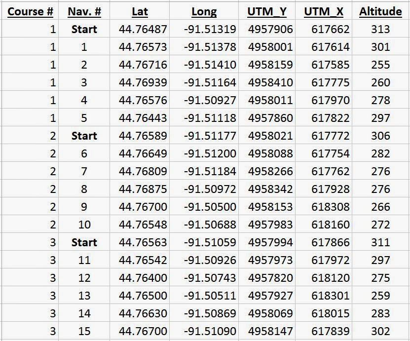
Using the map shown in figure 1 we were able to plot the points using the grid. For better understanding I have added a shapefile of the start/finish points as well as the flag locations. When we performed the exercise we were not given this shapefile. Instead we were given the table shown in figure 2 with the location and elevation of each point.
Figure 1 shows one of the maps used to navigate the priory course. Using the 15 points shown above, the course
was split up into three tracks. The track we navigated started at "2 Start" and included points 5-10. Originally the
groups were not given the point feature class indicating the exact locations of the points, instead we were given
a table with coordinates in UTM and lat. and long. which we were then supposed to plot on our maps using the grids
we created for each map. The map above was created using a UTM grid at 50 meter intervals.
Figure 2 shows the information describing the locations on
the orienteering course at the Priory. Either decimal degrees
or UTM coordinates could be used to plot the points. Another
useful feature was the elevation. The terrain at the Priory was
quite variable and often times knowing the elevation helped
guide your eyes while searching for the flags.
Figure 3 Shows a basic illustration of how
distance and azimuth can be used to find
a bearing and navigate a map. The image
also shows the starting point of our
navigation course. This view is from the
"runners" perspective looking back at
the person walking the pace count, and
the other in charge of finding the bearing.
Navigating the course worked most efficiently with one person in charge. The demand for one person to direct the others comes from the nature of the three tasks. One person must diligently monitor the group's bearing, another must keep track of the pace count, and another runs ahead to a land mark. The runner is more of a safety net. If the landmark (tree, rock, stop sign, corner of building, etc.; unique features) is in line with the bearing, then as long as the group reaches that location they won't be off course. Once at the land mark, the bearing is found, a landmark is picked out, and the runner goes to that new position. The next task is more a matter of consistency. As long as the pace counter keeps a consistent stride and walks a straight line, the distance to the orienteering flag should be accurate. We found once the runner reached the landmark, then the pace counter could start walking, and the compass holder could help make sure the pace counter was walking a straight line on the bearing. Figure 3 shows a quality example of the environment during the first section of the course, as well as a visual graphic of using distance and azimuth at a conceptual level.

Discussion

One of the difficulties came when the word "race" was introduced. Naturally everyone wants to win, so speed is a major factor. Unfortunately we learned speed was not the ONLY factor. With rushed careless work came results of the same quality.

One of the flags we struggled with was a product of hasty work. When plotting the points our analysis of where we thought the point was, told us to look on the East side of the hill. The flag was actually located on the base of the North facing slope. The green point labeled "8," in figure 4, shows where point 8 actually was, and the purple arrow in that same figure shows where we plotted the point. This error only was a difference of 30 meters or so, but this meant the flag around the side of the hill and out of sight. Looking at the contour lines of figure 4 can give you a better understanding of how the hill is shaped and the problem we encountered.
Figure 4 The yellow dashed lines show how the UTM grid can be used to successfully find point 8 (UTM_X: 617,928 and UTM_Y: 4,958,342....values taken from figure 2). One of the points was placed 30 meters farther south than the
actual flag location. This meant we took the path of the purple arrow, up over the hill and back down the other side.
In addition to the wrong location, we were also looking 10 meters higher than the actual flag location. It wasn't until we
looked at the coordinates again and found a more accurate location that we found the location 30 meters to the north west.
Figure 5 shows an example of how
vegetation can make following a bearing
difficult. Having to weave in between trees,
over fallen trees, through brambles, along
steep slopes, etc. All of these impact the
number of steps taken and create error
when trying to interpolate the correct
distance from the pace count.
Another problem we encountered was the systematic error that resulted from the changing environment. Areas that had dense foliage were difficult to traverse meanwhile keeping an accurate pace count and bearing. Figure 5 shows an example of one such difficult situation. In an ideal world a navigator could walk straight from point A to point B, without change in elevation or hazards. We were not in an ideal world, instead of walking the tangent we had to weave between trees, over fallen trees, struggle through brambles, and traverse steep slopes.

We found the longer the distance the greater the systematic error would be. The example of this was when traveling from point 8 to point 9 (figure 4, point 8 is centered in the northern portion of the map, and point 9 is on the eastern boundary line about half way up the map). Such a long distance increased the number of bearing readings we had to find and the chance of error from each new reading compounded to the point where we had to stop and think critically about the bearing we found and where we were on the map.

Figure 6 is an example of the pine trees found
on the eastern side of the map. Although the
area they covered was significant, the
orienteering course only included one point,
point 10, within the pine forest boundaries.
For the most part, the pine trees were devoid
of any underbrush.
Another aspect of the environment that influenced our orienteering was the thickness of the brush. Figure 5  shows and example of the thick underbrush that slowed us down and physically hurt to walk through because of the thorns. Then on the reverse side figure 6  shows the pine trees that were spaced out and in rows, devoid of underbrush. This area was the easiest to traverse, but also not a very large area nor a large component of the course. If you look back at figure 4 you can see the solid green semi-circle of green on the eastern portion of the map with only point 10 within it's boundaries.

Conclusion

After an immersive learning experience in the forest, we came out with a new understanding of orienteering. Our group actually finished tied for 2nd out of the 7 groups in this geospatial field methods class. We weren't without our delays and detours, but neither were the other groups. Our concluding thoughts of the lab were most exclusively focused on elements of the map that helped/hurt out navigation.

A general consensus by the group was that the base map was integral to successful navigation. Being able to look at your surroundings, analyzing tree lines, features in streams, gaps in the forest, etc. With just shape files and contour lines we wouldn't have been able to use many of the visual cues we ultimately relied on most to validate our progress between points.

Another aspect that would have been nice was more precise contour lines. The map I created wasn't used for the navigation, the maps we did use only had the 5 meter contour lines. Although these maps looked more aesthetically pleasing, we had a couple instances where reading the layout of the land was difficult, an example was at points 8 and 9 when the aerial image alone couldn't tell us exactly where we were on the map.

The grid was another topic of discussion. The initial plotting of the points exclusively used the grid; so, having a precise grid would have made plotting the point more accurate. Then on the flip side if you had a precise grid, say 20 meters, it would interfere with analysis during the majority of the exercise which was navigating from point to point. So the issues with the grid were how precise does a cartographer make it, and what color is best?

At the end of the day we were happy with our performance. I think, given the lack of everyone's orienteering experience, we performed admirably. The maps helped in unexpected ways when intuition was involved. And when the maps left us a little confused and wanting, we made do with creativity. In conclusion this was an effective exercise for group cohesion and on the fly critical thinking.

Sunday, April 13, 2014

Surveying with the Total Station: Creating a Micro/Meso Topography of Campus

Introduction

Continuing on with surveying methods, this week's lab focused on collecting data with x, y, and z coordinates. Working in small groups of three, we were given the task of surveying out the micro/meso topography of a one hectare plot area. This was done using a Topcon total station blue toothed to a GMS-2 GPS.

Study Area - For this project our study area was a hectare (100 meters x 100 meters) plot located in the campus mall area of UW-Eau Claire. Most of the study area was uniform in flatness, with a general sloping trend towards the stream which runs almost parallel to the path between flags 2 and 3, shown in figure 1. The area around the stream had a much greater slope which will be evident by the DEM images created in ArcScene, shown later in the report.
Figure 1. This panorama was taken from the corner of an approximately square hectare area. The study area,
highlighted in yellow, is located on the University of Wisconsin - Eau Claire campus mall area. The blue arrow
shows the occupied point where all the points were surveyed from with the total station. The orange arrow,
just to the left of the bridge, shows the location of the back sight used to orient the total station.

Methods

Figure 2 Shows how to collect a
point with the Total Station. One
operator will look through the lens
of the Total Station aiming the
crosshairs in the center of the prism
on the top of the pole. The other person
will try to remain as motionless as possible.
Once the point is "shot" the pole person
moves to the next point.
I have a more detailed step by step walk through of the total station on my "how to" blog. However, I have listed a VERY generalized process below.
1) Set up the Total Station....secure tripod into the ground, use the proper levels the balance the system.
2) Set up the Blue Tooth from GPS to Total Station.
3) Set up a TopSurv Job.
4) Collect GPS points
5) Set your occupied point and your backsight
6) Collect Data
7) Export points to a shapefile from TopSurv using Active Sync.
The exported file will be in a text format. Before a shapefile can be created the text file had to be opened up and edited.

Header>>Delimiter(,)FileFormat(Name,Lat(North), Lon(East),Ht(G),Codes)<<

The highlighted portions need to be deleted. After edited, the file can be exported as a text format in comma delineated format. From here the file can be converted into a shapefile. Figure 3 shows the results of the total station after the shapefile was created.
Figure 3 shows the one hectre plot of land we surveyed with the Total Station. As you can see the UW-Eau Claire campus has changed recently, we surveyed in the middle of the green space shown in figure 1
Once the elevation points were added to ArcMap, Kriging (3D Analyist) was used to create a elevation surface. The decision to use Kriging to create the surface was based off my analysis during a previous lab which analyzed the various types of interpolation methods: IDW, Natural Neighbor, Spline, and Kriging. My main decision to use Kriging was because it created a new surface and created new values even where data was not collected. Kriging creates the new surface based off the first rule of geography, assuming that closer points are more closely related than those farther away. Figure 4 shows the results of my group's kriging surface from the surveyed data.
Figure 4 shows the resulting kriging surface from the Total Station survey. Over 130 points were collected over this one hectre area. More points were collected over area's with high slope, all of which were along the river. The elevation change from this model was just under five meters.
Once the surface model was created for my group, the other groups survey models were added to ArcScene. Although each group had to survey a one hectare area on the campus mall, not all surveyed the exact same location. Even with the slight differences in the area surveyed you can still see the differences in elevation that the survey's recorded, figures 5 and 6 show just how well the survey's match up.
Figure 5 shows five of the groups in Field Methods all overlayed on top of one another. For a better
analysis of the area I have created some landmark features giving clues to the elevation changes on the
kriging models. The bridge over the Little Niagra creek was difficult to shoot and may look different if
more points were collected closer to the base of the bridge. Also take note in the gaps between the surfaces.
There was over eight meters between the lowest values in group 2 and those of group 6. The color scale on
the top of figure 5 is only applicable to the top layer of group 2. 

Figure 6 shows a view point almost looking almost parallel to the ground. This viewpoint better illustrates the differences in elevation between the five group's layers. Groups 1, 3, and 4 had similar elevation values; meanwhile, groups 2 and 6 were outliers, sitting either significantly lower or higher, respectively. This discrepancy likely is the result from the inaccuracies of the GPS unit used to collect the occupied point for the Total Station. This goes to show ho the accuracy of the survey, with the Total Station, is only as accurate as the GPS used to collect the occupied point.

Discussion

Most of the difficulties with this lab came during the initial setup phase, specifically when trying to set the back sight. We had briefly been instructed on the basics of the total station; which included, set up of the total station for both the physical assembly and leveling of the station as well as the technical steps necessary before surveying can begin. However, we lacked the hands on experience of operating the total station, which resulted in amateur mistakes. When we tried to set the back sight for the total station to orient north with, we made the mistake of having the lens flipped in the wrong direction. We thought since the knobs could be used to precisely move the lens that they should be facing towards you. It was not until 2 hours of trouble shooting that we finally called it a day and had to try again over the weekend after we had found the error in our methods.

Additional difficulties came with trying to accurately capture the elevation changes along the river. One of the problems arose with a broken knob on the pole which raised and lowered the height of the prism. It was set at 2 meters, so this wasn't a major concern. However, if the knob was intact we would have raised the prism higher when we were surveying behind the bridge. There were a few spots along the stream just behind the bridge that we decided to skip because we didn't find it necessary to move the total station to collect two or three more points. Also, just having a varied surface was a difficult trade off. Since we had never used the total station to collect elevation we were not sure of how many points would be necessary to accurately portray the elevation changes. We did take more readings along the river, where the most severe elevation changes were found.

In addition to individual group struggles, there is also the issue of accuracy that comes with the GPS. The Total Station itself is extremely accurate. However, the Total Station has to be given an occupy point. This occupy point is the reference point for all other points in the survey; unless the total station is moved, then the new occupy point will act as the reference point. So although each group may have followed similar procedures and surveyed a relatively similar area, the GPS gave different reference heights for each survey and as a result the kriging surfaces don't match up, in regards to elevation.

Conclusion

Surveying with the Total Station was an effective experience into another important method of data collection. Prior to this I had only used a GPS to collect data. Once the Total Station was set up, the actual surveying went much faster than using a GPS; also, the Total Station was much more consistent. With a GPS you can get high PDOP values behind buildings and your data will be skewed. With the Total Station, there is likely only a handful of GPS points you will ever need to collect, lessening the chance of multipath effects on the GPS signal. In the future I hope I have the opportunity to use a Total Station again, but with a more accurate GPS at the survey grade level.

Sunday, March 2, 2014

Priory Navigation 1: Creating a Field Navigation Map and Distance/Bearing Navigation

Introduction

Navigating during field work is of the utmost importance. Whether you are surveying the land for a future building or trekking through the forest on vacation, knowing your location is important. With the invention of GPS, navigation has become increasingly simple, to the point where novice navigators can rely on the GPS to take them wherever they need to be. The problem with this heavy dependence on technology is when it fails. Even a top of the line GPS will give extremely inaccurate data or fail altogether in thick foliage, in/and around buildings, hilly regions, etc.. This is why the effective use of map and compass becomes so important. With this idea of 'low tech' skills, this lab will focus on designing an effective map for navigating a UW-Eau Claire property just south the campus.

The navigation of the course will be two part. The first excursion will be a race to see which group, of three, can complete the course the fastest using only a map and compass. The second day on the course will have the same goal, but each member of the group will be equipped with a GPS and paintball guns. If hit, the group will have to pause for 30 seconds before they can continue on in their navigation. This will test the diligence of the group and the quick thinking navigation in the event of obstacles.

Just like loading a data dictionary in a GPS, too much information on a map will slow you down. Added elements will make essential elements difficult to interpret; and, a constant coverage of ink on the map, maybe from an aerial photo, will make field notes difficult to add. In order to make the best map careful thought about the exercise was needed.

Since we will be using pace count--a technique of counting steps and interpolating the number of those steps to a distance, usually a standard number of steps per 100 meters-- to measure our distance, it will be important to know the topology of the area. Specifically, knowing where steep hillsides are, if there are lowland areas which could create swampy conditions during the winter thaw, etc. Other factors that would be helpful would be landmarks. These landmarks could be used to orient yourself with the proper azimuth calculations. Unfortunately, there are only a couple buildings on the property, and there will be dense foliage blocking these buildings from view. For this purpose I chose to exclude buildings from my map in order to cut down the the clutter. In the end I chose to include:
  • 5 meter Contour Lines, with labels
  • Navigational Boundaries
  • No shooting zones
  • Flag Boundaries
  • Roads
  • A grid overlay (added in layout view)
The final requirement is unique to this exercise. In order to familiarize ourselves with different units and coordinate systems, the professor made a requirement that we use a grid based off meters and another off decimal degrees. The map with the meter grid will be projected using the UTM coordinate system while the other will be projected using the Geographic Coordinate System. Shown below in figure 1, the Universal Transverse Mercator coordinate system (UTM) divides the earth into 60 zones, each in six-degree bands of longitude. It is projected using a transverse Mercator projection. The Geographic Coordinate System is based off of a spherical representation and uses latitude and longitude for location purposes.
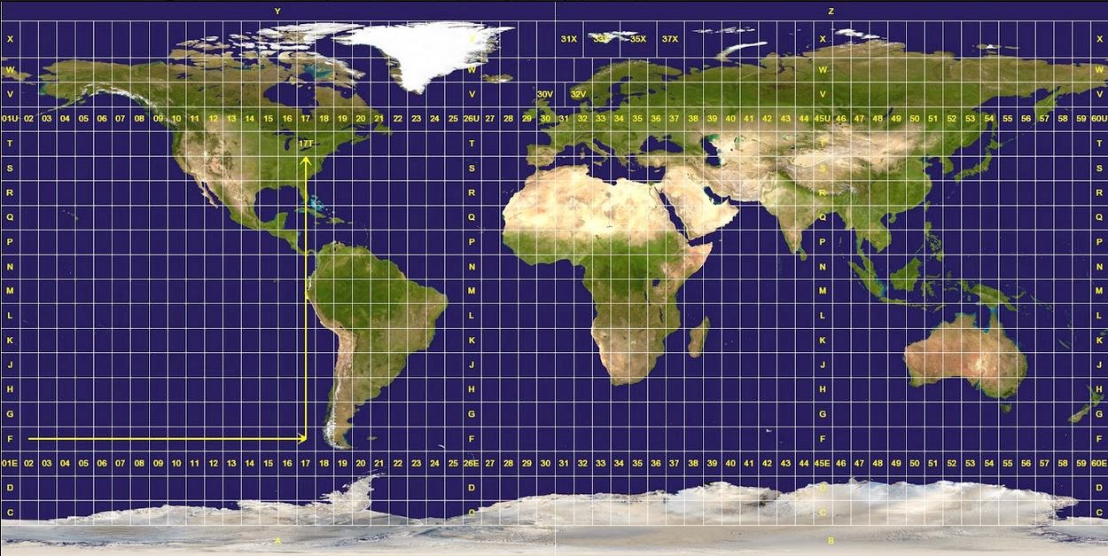
Figure 1 shows the world divided up in the 60 zones of the UTM coordinate system. The Universal Transverse Mercator coordinate system is projected using a transverse Mercator projection.

Methods

Figure 2 Shows the location of the Priory (red),
three miles south of the UW-Eau Claire campus
(blue). The Priory is a 112 acre parcel of land
consisting mostly of wooded land with three
building complexes. The Priory was acquired
in 2011, and loaned to UW-Eau Claire for
the next 15 years.
This map is part of a larger activity where the class will go out into the field and navigate a course located at the Priory. The Priory is a 112-acre parcel of land consisting of mostly wooded acres in the town of Washington, which is located three miles south of the UW-Eau Claire campus, Figure 2 shows its general whereabouts. The Priory also contains three building complexes totaling approximately 80,000 square feet; however, for our purposes the building's will only serve as areas to be avoided.

For the actual activity we will us a map and compass to navigate the course. These tools will be essential to the method of distance/azimuth navigation (azimuth is referring to the angular measurement in a spherical coordinate system; on a compass it would refer to the degrees from magnetic north). Essentially if you know your location, you can use an angle with a distance to find another point. The map is used to find your location/the location of the place you want to be; and, the distance/azimuth can be interpolated from the map. Figure 3 shows an image of the compasses we used during our navigation, as well as some of the components on the compass.
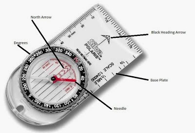
Figure 3. A common type of compass for its low cost and easy to use features. Some of the important features to identify are the heading arrow, which indicate your direction of travel. Also note the red arrow inside the compass dial which points to the red "N". This can be used in finding a bearing or, for more general purposes, to find north. The dial is final important aspect of the compass. The dial can twisted and, with the proper knowledge, used to find a bearing.


Basics of Finding/Following a Bearing:
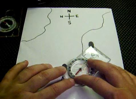
Figure 4. Align the straight edge of the compass between your points, sometimes it's helpful to even draw a line on
you map to indicate your direction of travel. Make sure to the compass facing the correct way. Note the arrow on the
top right of the compass, this should be pointing TOWARDS your direction of travel.

1) Align edge of compass between points A & B, as shown in figure 4.

2) Orient compass dial to map North/True North, as shown in figure 5.

3) Record the bearing closest to the direction-of-travel line on the compass. This will be the bearing you will need to follow to reach your destination.
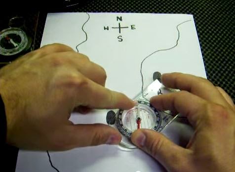
Figure 5. Orient your compass to your map. Keeping the edge of your compass connecting the two points, turn the dial on the compass towards North on the map. Often times orienteering maps with have grids on them which you can use to help guide your orientation of your compass. This can be done by making the grid parallel to the lines on the inside of your dial. figure 4 shows a close up of the compass and is easier to see the parallel orientation lines.

If you have multiple points to travel to, it is common practice to write down the bearing on your map so you can continue to navigate your points without having to find your bearing at every point. Figure 6 shows the compass on the map with the bearing towards the direction of travel.

4) Keeping the compass at a comfortable chest height (preferably away from any metal objects), turn your body until the red end of the needle is in the red arrow/box on the compass. This position is often referred to as getting "red in the shed."

5) Now facing the same direction, turn the dial to the same bearing you just found.

6) To reach your location, all you need to do is keep the red end of the needle in that red box and you will travel along that same line you drew from points A to B. Figure 6 shows a compass oriented to the map. Notice how the lines inside the dial are parallel to the grid lines on the map. This technique is helpful when trying to ensure the compass is oriented as accurately as possible to north on the map.
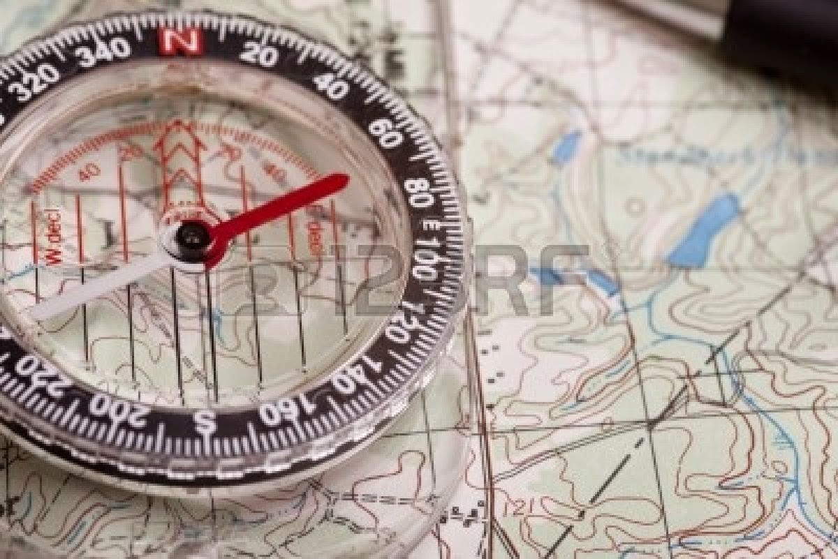
Figure 6 shows a compass oriented to true north on a topographical map.
The final aspect of navigation will be calculating the distance travel while out in the field. Following the bearing is important, but if you don't know how far you have traveled you will still not know your accurate position without analysis of your map. A rather simple method of keeping track of your distance traveled is called "pace count." As described earlier, an individual's pace count is calculated by walking a standardized distance and remembering how many steps were taken. To lessen the counting and ease the process, only every other step is counted. For example, only count the number of steps you take with your right foot. Once your pace count is determined you can use the number of steps you take to interpolate the distance you have traveled.

Sometimes long distances between points must be traveled. In order to ensure you do not lose track of your pace count tools or strategies can be involved. One method is to break off a twig every 100 meters and put it in you pocket. There are also cheep tools such as beads on a string, shown in figure 7, which act as a counting mechanism.
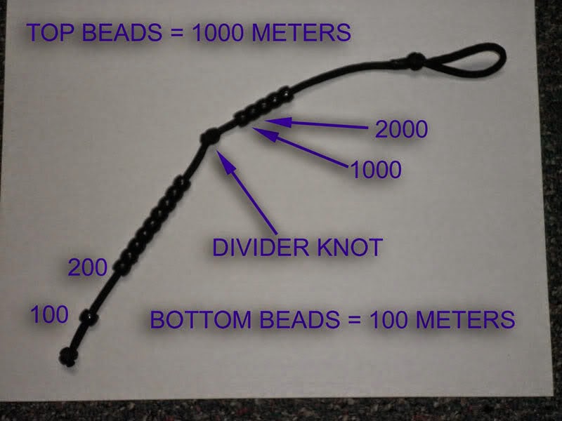
Figure 7 shows a cheep tool which can help you remember the number of
steps you have taken between you points. Once you reach your desired
point you would reset the beads to zero.

Discussion

This was a straight forward assignment, but it wasn't without its bumps. I couldn't figure out how to add a grid for the longest time. I knew it was in the data frame properties window under the 'grids' tab, but for some reason when I was creating the grids they would not show up. After some time playing around with the various tabs in the properties menu, looking in the 'Help' files, and trying to add new grids I figured it out. The units were not in meters and the intervals were set much too large to appear on the grid. Figure 8 shows the interface where I had my moment of clarity and fixed the necessary parameters.
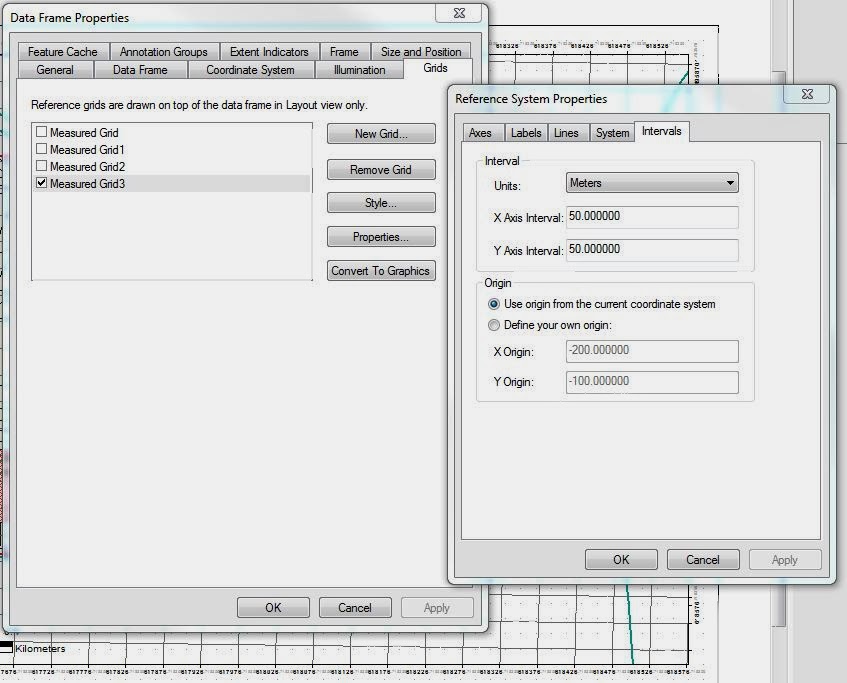
Figure 8 The data frame properties menu. Here it is possible to add a grid
in the layout view. For the navigation of the Priory, a 50 meter grid was
decided to be of best fit.

Another topic of debate was how many map elements would be necessary for an effective map. I have a personal fascination with elevation. I knew the DEM would be too much, but the elevation needed to be displayed since it would be an integral part of the navigation. Eventually I chose the 5 meter contour lines to best portray the lay of the land, yet freeing up the map from unnecessary clutter.

Additional map elements could have been added. Knowing where soft boggy areas are, poor footing along slopes, and other such areas would be helpful for navigating. Not all of these elements could be added without the need of a magnifying glass, but if there was a way to display them, navigation in the field could be improved.  However, I have not yet been to the Priory course and lack the first hand experience of the terrain. With this limitation, the contours and the aerial images were the main tools I used and I could not ascertain such fine details from this small of a scale (1:4,500).

Figure 9 shows the final product for the map. A grid at 50 meter intervals was used, as well as contour lines at 5 meter intervals.
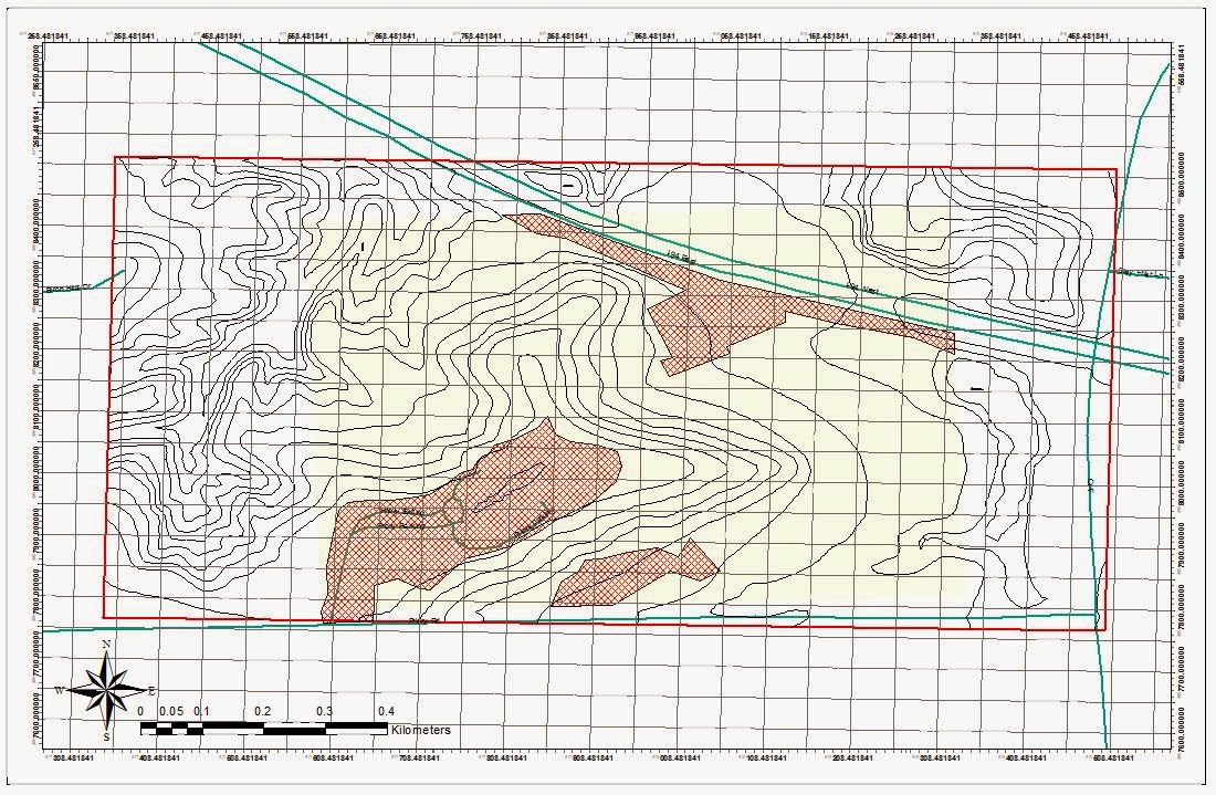
Figure 9 Shows the map of the Priory with 5 meter contour intervals, roads, 'no shooting' zones, boundaries for both
point boundaries of the navigation course (yellow polygon), and a boundary for the navigation zone (hollow red square).
NAD 1983 UTM Zone 15N

Conclusion

The effectiveness of the Priory maps will not be known until out in the field. However, based on the tasks mentioned in the write up and the elements included in the map I have confidence the map will serve its purpose. The important component to the map is to make sure the grid can be used effectively to locate the points on the map. Additionally, the grid will be relied on in the field while using pace count, distance, and azimuth to navigate between the points. Until then theory and personal judgment will have to satisfy the requirements until the field testing begins.